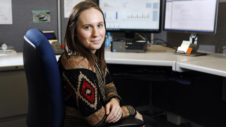
MALVERN, Pa. — When Heather Myers registered for a data visualization course this past spring, she anticipated learning techniques and tools to depict large amounts of data. Little did she know she would receive global recognition from Tableau, a leader in business intelligence and analytics software.
A web administrator for the Pennsylvania Historical and Museum Commission (PHMC) in Harrisburg, Myers decided to enroll in the Master of Professional Studies in Data Analytics program offered online through Penn State World Campus to further her technical acumen.
At her job, she maintains a variety of websites and social media accounts for the Commonwealth, and serves as a liaison between IT and the business offices for PHMC. Myers saw the degree as an opportunity to take the skills she already has — web and social media analytics, information technology services — and learn new skills. Plus, she had a bachelor’s degree in information sciences and technology from Penn State World Campus and was accustomed to the online format.
For the course’s final project, Myers was tasked to create a dashboard of individual data visualizations using Tableau. Wanting to integrate her studies with her job, she decided to depict the agricultural history of Pennsylvania — a decade-long initiative of PHMC because of its influence on the state’s economy and people.
Her instructor, Pam Vercellone-Smith, encouraged students to submit their projects to Tableau’s Student Viz Assignment Contest. Myers did — and came in first out of 250 submissions from across the world.
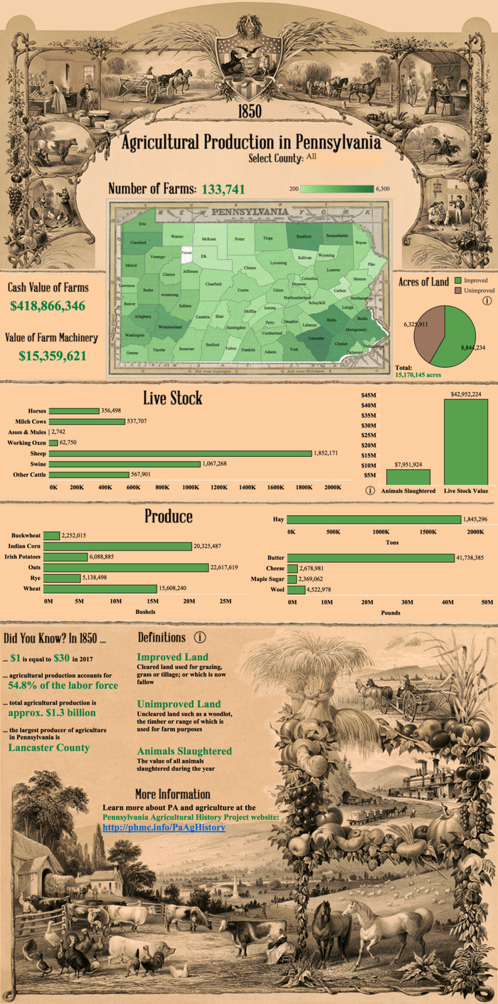
Myers’ winning visualization combines a timeless practice with the latest advancements in technology. Her interactive map of Pennsylvania depicting the value of farms and amounts of livestock provides users with a glimpse into agricultural life in 1850.
This project was no small feat for Myers.
While she was already in possession of the 150+ year old dataset, it needed to be digitally converted from a PDF file. In some instances, Myers compiled data from handwritten manuscripts. But even then, the data was exceptionally complicated. Over time the county boundaries changed, which required Myers to not only research a variety of boroughs, townships and districts, but to also meticulously clean and reclassify the data as needed.
Next Myers designed her dashboard. To ensure county lines were historically accurate, she incorporated a spatial file from the Atlas of Historical County Boundaries and used an 1853 map from the Historical Maps of Pennsylvania as a custom background. She also chose to include the original spelling and word spacing from the census — using "milch" cows instead of milk cows and "live stock" instead of livestock. To tie the entire collection together, she incorporated lithographs of diplomas from local agricultural societies in the 1850s.
The result — a brown and green, vintage-looking visualization— brings the century-old data to life. The data can be pared down by county, so individuals can compare and contrast production and value by geographic area.
As noted by the Tableau website, “the judges particularly liked the completeness of vision, storytelling and design of Heather's viz.”
Vercellone-Smith, the course’s instructor, was equally impressed.
“Heather is an excellent graduate student with truly impressive design skills,” she said. “Her dashboard visualization project was quite exceptional. Not only did she have to manually compile a large amount of agricultural data from historical records, but she also had to account for the differences in the county boundaries between 1850 and 2017. Her design layout, color selections and use of historic lithographic images for the background imagery ultimately created an integrated dashboard design that not only explains the agricultural data well but also conveys a clear, complete and compelling story.”
The project provided Myers with the opportunity to combine her professional life with her studies, to be challenged, and to learn something new.
“It was a huge amount of effort in the beginning,” said Myers. “It got easier with time. Despite some challenges along the way, I’m proud of the final product.”
Myers’ award-winning data visualization can be found on Tableau’s blog.


